A lot of business websites look brilliant in the early stages, with sharp design, strong content, and something that feels genuinely impressive when first presented.
In our experience, the challenge usually comes later, once the build starts getting pulled and pushed through multiple rounds of feedback, internal opinions and the inevitable arm wrestling between SEO priorities and brand guardians over structure and hierarchy. Somewhere between “just one small tweak” and the fifth homepage revision, what began as a clear, user-focused experience can start to drift as messaging shifts and different priorities compete for space.
Somewhere in this process, the person actually using the site in the real world, on their phone, between meetings, during a commute or while juggling ten other things, can easily be forgotten. Clarity rarely disappears in one big decision. More often, it slips away one “can you just…” at a time.
At The Creative Branch, we know that business websites are far more than digital brochures. They are often the first conversation a customer, supporter or decision maker has with your brand and, unlike most sales teams, they do not clock off at 5.30. Which is exactly why the user experience and interface need to work from the very first click.
So what does adaptive UX and UI design actually mean in practice?
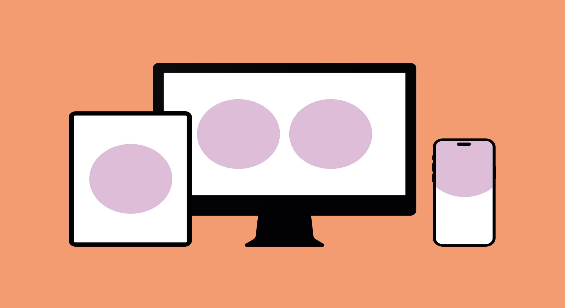
If you think of responsive design as making a website fit the screen. Adaptive design makes it work for the person using it.
This difference matters a lot.
While responsive websites adjust layouts to suit different screen sizes, adaptive UX and UI goes further by reshaping the experience itself. Menus, forms, content hierarchy and key actions shift based on context, making the site feel more intuitive wherever and however it is being used.
The experience changes, not just the shape of the page.
We see adaptive UX and UI as the practice of making sure a website works properly in the real world, not just in a polished desktop preview. For a finance director researching services on the train, a charity supporter making a quick donation from the sofa or a hotel guest who just wants to book a room without clicking through five different pages.
Why “one size fits all” is usually where things go wrong
A website that responds to its audience builds trust more quickly because it makes the experience feel intuitive from the outset. When people can immediately find what they need and move through the journey without friction, they are far more likely to take action.
After all, no one has ever converted because the navigation had seven top level menu items and a dropdown that looked like an airport departures board.
That sense of ease also plays a huge part in whether people come back. A customer browsing on mobile needs a journey that feels simple and easy to use in the moment, while someone returning later on desktop may want more detail, from reviews and comparisons to the supporting information that helps them make a more considered decision.
Relevance shortens the gap between interest and action, and that matters whether you are running an ecommerce brand, a professional services business or a charity.
The cost of getting this wrong is rarely just aesthetic. It shows up in abandoned checkouts, missed enquiries, lower engagement and internal teams spending time answering questions the website should already be answering.
There is also a practical benefit behind the scenes. When content is managed once and works properly across every device, your team spends less time fixing issues and more time focusing on growth, campaigns and customer experience.
Accessibility matters just as much, not as a compliance exercise or a box to tick, but because your website should genuinely work for everyone who visits it, regardless of the device they are using, their individual needs or how reliable their connection happens to be.
Good design should never leave people behind.
The Salesy bit
Too often, sites are shaped around internal opinions rather than how people really use them, unless a site development is properly managed throughout the build, by launch day the homepage is often trying to be a salesperson, a brochure, a helpdesk and a brand manifesto all at once.
At The Creative Branch, adaptive UX and UI starts long before anything is designed or built. Every project begins with proper discovery to understand how your business works, how your customers move through it day to day and what the website actually needs to do.
From there, we build flexible digital experiences that are designed to work properly across devices, platforms and user needs. Whether we are working in WordPress, Shopify or a bespoke build, the focus is always on making the experience clear, fast and easy to use.
For us, adaptive design is not something added at the end. It is built into the way we think, the way we challenge ideas in the studio and the way we guide projects from first concept to launch and beyond.